Starting with Excel 2016, Microsoft added the TreeMap chart to its range of chart types. This article will show you how to create one and, more importantly, how to interpret it.
Hierarchical chart
The compartmentalization chart is part of the family of hierarchical graphs, like the sunlight. It allows you to see at a glance the largest elements compared to the entire data.

Creating a treemap in Excel
Creating a compartmentalization chart is not very complicated to do. What matters is the presentation of the data in your table.
Let's take the example of extracting the list of all files contained in a directory and its subdirectories, as described in this article.

As the picture shows you, each hierarchical level is distinctly viewable in different columns. In last column, we have the size of each file. These values will define the size of each rectangle in the chart.
- Select one of the cells in your data table.
- Go to the menu Insert > Hierarchy Chart > Bucketing

Immediately, the following chart appears in your spreadsheet.
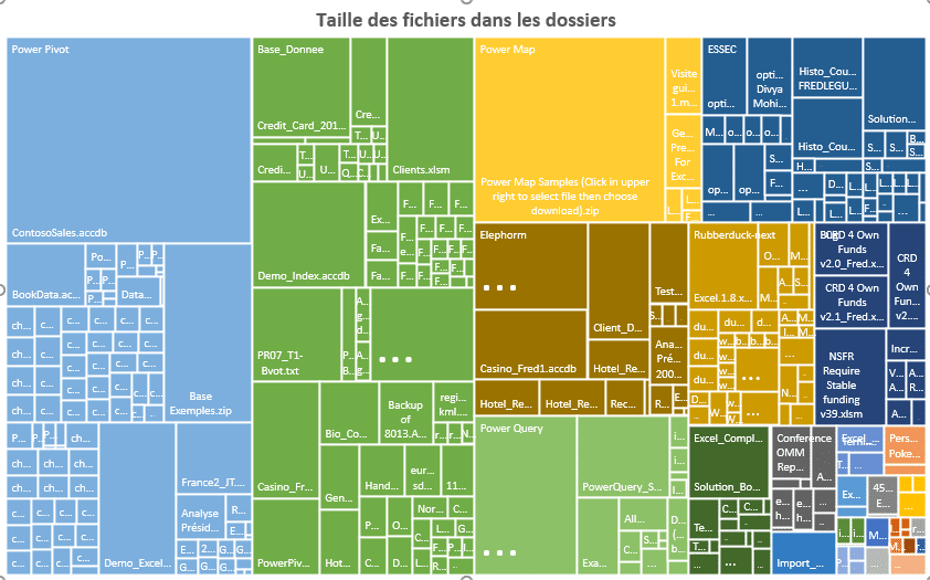
How to read this type of graph?
The graph may seem confusing but you should not look at it as a whole.
- First, the colors correspond to the first hierarchical level of your data.
- The name of the levels is written in the top left corner of the first squares: Power Pivot, Database, Power Map, ...
- The surface area of the squares or rectangles corresponds to the size of the files in the directories, in our example. So, the largest area represents the largest file in the directories
So in our example, we immediately see that the ContosoSales.accdb files in the directory PowerPivot and Power Map samples in the folder Power Map are the largest.

So with a Compartmentalization graph, you instantly identify the elements that occupy a larger proportion in your entire sample of values. Small areas have no interest in the analysis.
Hierarchical depth
The area of squares or rectangles do not show at what hierarchical level the important elements are located. A colored block aggregates data from all hierarchical levels. To visualize the depth of a hierarchy, you must use a sunburst graphic.


06/05/2021 @ 17:31 p.m.
thank you for this article, can we create this compartmentalization graph in VBA
06/05/2021 @ 17:59 p.m.
No idea. But why in VBA? To make the graph dynamic?